

How to measure cohort retention
How to measure cohort retention
A deep dive into the formulas, visualizations, and SQL you need to accurately measure and report on cohort retention—a guest post by Olga Berezovsky

How to measure cohort retention
👋 Hey, Lenny here! Welcome to this month’s ✨ free edition ✨ of my newsletter. Each week I humbly tackle reader questions about product, growth, working with humans, and anything else that’s stressing you out about work.
If you’re not a subscriber, here’s what you missed this month:
All the ways to grow your product
How to kickstart and scale a consumer business—Step 5: Finding product-market fit
Kickstarting and scaling a consumer business—Step 6: Building your growth engine
Subscribe to get access to these posts, and every post.
Q: You talk about retention a lot, but how do I actually measure retention? Specifically, cohort retention. I haven’t found any great guides out there.
I was also shocked to find that there wasn’t a great post out there on how to accurately and concretely measure cohort retention. Considering how important it is to all things product and growth—and how costly it is to get it wrong—this is a big gap. So let’s fix it.
To help us out, I’ve tapped Olga Berezovsky, author of the wonderful Data Analysis Journal newsletter, to get deep into the weeds of retention. Below, she shares the formulas, SQL queries, tools, and templates you need to measure, visualize, and report on retention. I’ve never seen this level of detail and guidance before, and I’m excited to share it here. Thank you, Olga! And enjoy!
You can follow Olga on LinkedIn and Twitter, and subscribe to her newsletter here.

Many analysts (and product managers, founders, and most people) are intimidated by retention. The graphs can be difficult to read, the definitions vary for each product and business type, and the SQL is complex. At the same time, retention is both the most important and the least understood metric at most companies. In my experience, it takes up to six months to nail accurate retention reporting.
On every team I was a part of over my 10+ year tenure as an analyst, I would continually work on our retention reporting. As one example, at Change.org, I was part of the Petition Starters squad, and by monitoring and slicing the Day 7 and Day 30 retention of users who started petitions, we grew “petition starters per day” (our KPI) by 450%. Each new petition generated new signatures, which helped us grow to over 450 million active users. Similarly, at MyFitnessPal (where I work now), Day 1 and Day 7 retention are closely monitored for every product initiative.
In this post, I’ll share the methods, tools, and strategies I’ve developed over the years to help you calculate cohort retention and understand the nuances of reporting on retention. For a primer on retention, make sure to read two of Lenny’s previous posts on the topic, How to increase your retention and What is good retention, to get an introduction and learn why it’s important to monitor and grow retention.
To recap, retention measures the ability of your product to keep users active over time. Retention for consumer businesses would have a different meaning than for enterprise, B2B, or B2C companies:
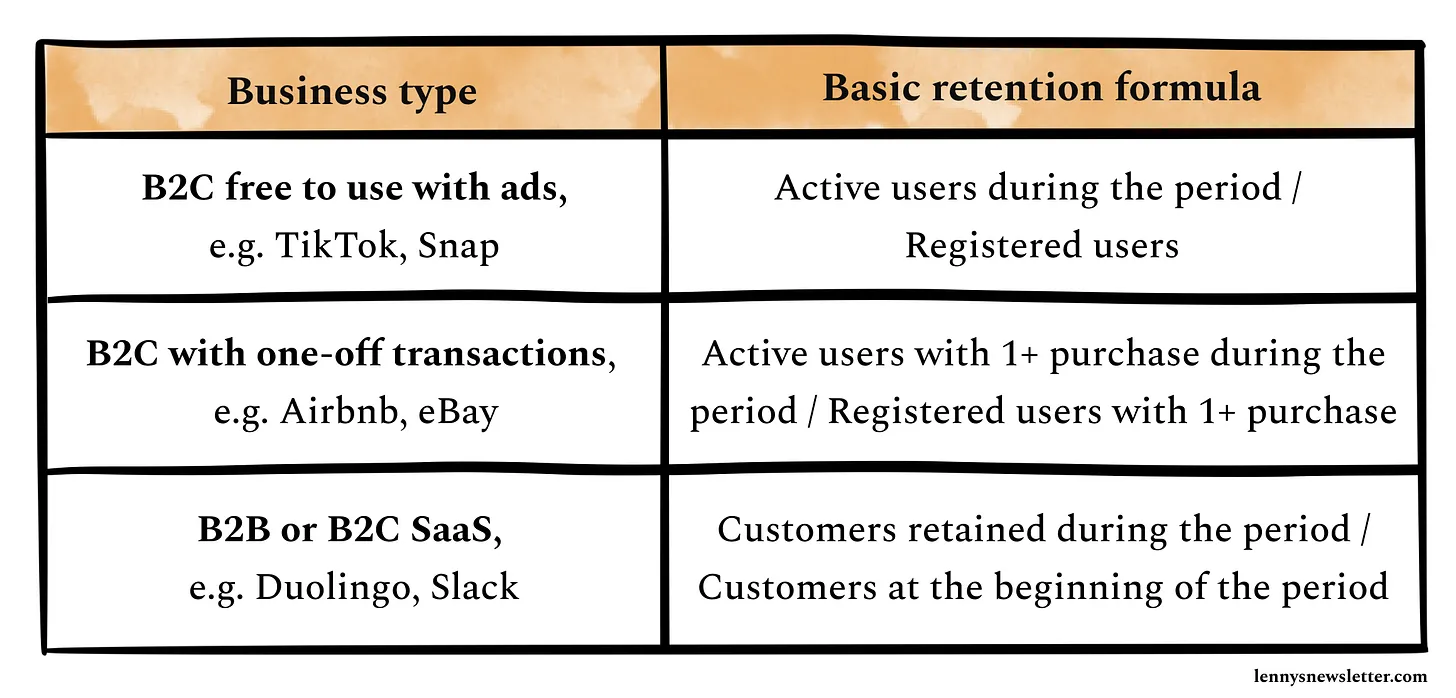
Step 1. Define “active”
As you can see above, a fundamental variable in calculating retention for most products is “active users.” But it’s not obvious what “active” means.
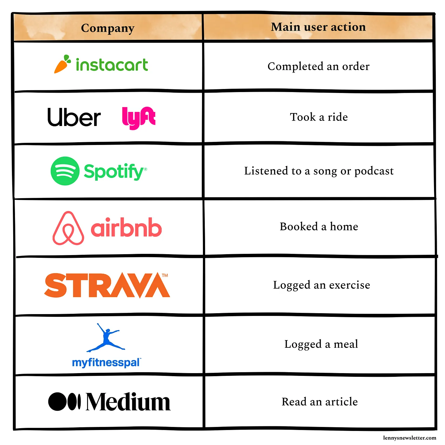
Below are the most common events used to define “active” across companies. Each of these events has its own downsides and limitations:
Visit: Too broad; you will overcount users, most likely having a challenge with unauthenticated and not registered users. Only relevant for the web.
Session starts: You’ll possibly overcount users by pulling in unauthenticated IDs. You will also need to limit the session length to a specific time range that should be unique to your product usage. If you don’t do this, you are likely to count background app refreshes, notifications, and any other app activity that is not related to user activity (read more: This Is Why You Overcount Your Daily Active Users).
Login or app opens: Same as above, as you will need a way to exclude new users with their first app open event for cohorted retention and exclude unauthenticated users and duplicates.
Web page views or screen views: Too broad; most likely will pull in all user types (dormant, lapsers, new users) into one bucket and over-report both DAU and retention.
Main user action (e.g. item view, search, log an exercise, transaction, etc.): Too narrow, and easy to miss active users who don’t do the main activity you expect but keep using the app ( adjacent users case), or they make a transaction from a different platform (app/web).
At different companies, I had to report DAU and retention based on all these event variations, sometimes even mixing a few of them together (session start + app open + main transaction).
Most companies use logins or app opens as main events for the “active users” definition. But given that I always aim for the cleanest and most precise data reporting, I’d recommend using the main user action as the activity event, for example:
Pros to this approach:
It ignores all the “noise” events, like visits, screen views, and logins, and tailors the activity event to only the main transaction or event that you expect a user most commonly does.
It gives you the cleanest sample of truly active users, whose behavior you can monitor and validate.
It is usually available across all platforms (unlike app open or visits) and data sources, making it easily accessible for reporting and monitoring.
Regardless of your business type, my recommendation is to use the main user action to monitor not only retention but other user activity metrics like DAU, WAU, MAU, and DAU/MAU ratio.
Step 2. Differentiate users from customers
Once your team agrees on what “active” means for your product, the next step is to segment your active users into free vs. paid. Your retention will have a different logic for each of these groups.
“A customer is defined as the person/group who is paying you. A user is a person using the product. In subscription products, oftentimes there are multiple users associated with a single customer. Or people are users before they are customers. You need to separate the definition and language between these two things for teams to clearly act on them.” — Brian Balfour, “Common Mistakes in Defining Metrics”
Depending on your business model, your retention output will be built on a different metric input, for example:

These metrics are your baseline for calculating retention. Now that you know who your active user or active customer is (e.g. a paid user who logged an exercise or a free user who read an article), you can start building retention to learn how often they come back.
Often a mistake I see SaaS companies make is reporting one “blended” retention, with a mix of free and paid users. This can be misleading, because users who pay for the product are likely to use it way more than free users. So the true activity of free users (and your “pool of opportunity” to convert) will be hidden.
Step 3. Pick your retention type
The next step in calculating retention is setting your timeline. As a team, you have to agree on what retention reporting type you should adopt:
X-day retention
Unbounded (rolling) retention
The method you choose will significantly affect your results.
1. X-day retention
X-day (also known as N-day or bounded) tells you the percentage of users who come back on a specific day. For example, for all users who join, what percentage return to your app on exactly day 14:
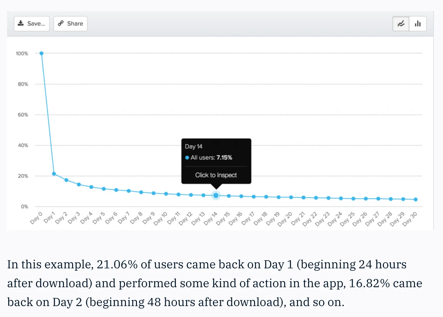
This is the most conservative retention approach and will return you a lower retention percentage.
2. Unbounded retention
Unbounded retention tells you how many of your users got back on a specific day or later. For example, for all new users who joined on a specific day, what percentage of users are using the product after 14 days (and not necessarily on day 14).
If your goal is to match retention with your user churn, this is the way to go. The unbounded retention value for month 6 gives you the percentage of users who returned after month 6.
So which approach should you use? Both are correct, yet both will return completely different retention data:
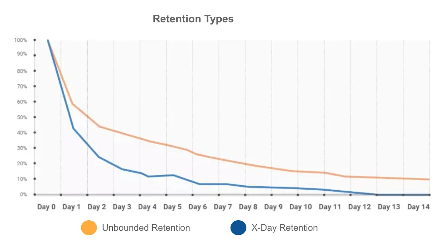
My general favorite method is unbounded retention because (1) I like my KPIs to be connected, proportional, and correlated to each other, and (2) unbounded retention is the inverse of churn, so it gives me another way to validate and test my data, increasing the confidence in my reporting (the higher the churn, the lower the retention, and vice versa).
But you should pick the method that works best for your analytical objective and your users’ natural behavior:
If your users use the product regularly (e.g. logging foods every morning, recording exercise, or listening to a podcast daily), use X-day retention.
If your KPIs are coded to a specific time range (e.g. 30 days trial, 28 days active, 7 days resubscriber), then you probably want to also count only those users who return to your product within a set period of time and use the X-day method.
If you don’t expect users to come back on an average daily/weekly/monthly basis, and the user engagement pattern is more chaotic, then use the unbounded method.
X-day retention is more appropriate for short-term analysis like measuring the onboarding funnel or marketing campaigns.
Unbounded retention is more useful for measuring long-term user behavior, especially if you want to segment your users into retention groups (6M, 9M, 1 year, 2 years).
Overall, a rule of thumb in analytics is that if your product is SaaS, you are likely to be tied to a specific time bound (paid subscription length, trial length, etc.). Because of that, it’s recommended to follow X-day retention. If you are not in SaaS but in a B2C or consumer transactional or social business, then you can be more flexible and adopt unbounded retention.
Step 4. Reporting retention from BI applications vs. SQL
1. Getting retention via product analytics tools
Today’s popular product analytics tools support retention reporting. Each application has its own specifics or limitations. Reporting retention from these tools is doable (and becomes common), assuming you have the right events you need, which often is not the case.
To make things easy, Amplitude, Mixpanel, Kissmetrics, Google Analytics, Adobe Analytics, and others are integrated via SDK with the client side (browser, app, device) and pass you client data, which is usually user and app activity. While some of these events can be used for retention reporting, others won’t be sufficient. Read more to learn about when to use client-side or server-side events for analytics and why most analytics efforts fail.
Often, to make changes to a subscription or a purchase, users are routed from the app to the app store (Apple Store, Google Play, Stripe, PayPal, etc.) to activate a trial, complete a payment, cancel or renew a subscription, etc. That’s why this payment data is likely not available in the app (client) analytics. So you won’t be able to access it in Amplitude or Mixpanel right away. Therefore, for SaaS products (those that report retention based on DAPU or DAC), you might not have the ability to replicate retention in product analytics tools, because they won’t have payment data.
This is solvable, and your company might already address it. The common solution here is to load payment data into product analytics tools from a database via Segment or a data pipeline (assuming you already receive this data from a payment provider like Stripe/Apple/PayPal). But if you work for a small startup and are in the early process of setting up reporting and analytics, this is likely not the case. And creating cohorted or even simple retention most likely won’t be doable at this stage.
Assuming you have needed events loaded in the product analytics tool, you can read the guidance on how to approach retention graphs in Amplitude, Mixpanel, or Google Analytics.
❗Heads-up: Amplitude, Mixpanel, or similar analytics by default report N-day retention. Read more about N-day or unbounded retention differences in Amplitude: 3 Ways to Measure User Retention. If your business is consumer social, you will have to change retention settings and customize it.
❗❗If you report retention from multiple sources—for example, from Amplitude and also from Tableau, which is sourcing data from a database—it will be very different, because of all the specifics described above: (1) rolling dates/N-day type, (2) different “activity” definition and tracking, and (3) possibly data availability and refresh gaps.
2. Getting retention via SQL
This is one of the common questions for analysts during SQL interviews and often is the first project to work on. It’s a multi-step process requiring a deep understanding of the business objective, a flexible approach, and data intuition.
Looking back at all the places I’ve worked, I don’t remember a case where you could come in and quickly run some SQL to cohort your users into the right retention groups. Usually, some work needs to be done to the underlying tables to bring the data to the appropriate format and structure to work with retention. Same with DAU, churn, LTV, anything.
First, you work on creating Sessions or Users or an Activity table that serves as a foundation for calculating your KPIs later. This table should have the right timestamp of user activity, event ID, user ID, properties, and measures you need. After the new table is tested, you can then work on creating downstream views for retention, DAU, or anything else.
When replicating retention with SQL, it’s easy to go wild and overcomplicate your approach. Follow these steps to stay on track and get the correct retention logic:
Step 1: Get the users’ first (initial) action—this is usually sign-up or the first purchase
Step 2: Get the user activity after the sign-up or purchase—based on your activity definition
Step 3: Get the total time in between the initial and consecutive user action (“retained_time”)
Step 4: Convert the total time to days/weeks/months as needed
Step 5: Group users into buckets based on the total retained time from the previous step
Step 6: Map and order users’ buckets based on their initial action time—sign-up or the first purchase
Depending on your underlying data and table structure, these steps can be done via a simple SELECT statement (like SELECT * FROM ready_to_use_retention_table) or another quick way, such as
SELECT
    snapshot_date
    , start_date
    , n_period
    , COUNT(user_id) AS n_users
FROM subscriptions
GROUP BY snapshot_date, start_date, n_month
or via multiple subqueries, self-joins, window functions, or a combination of all of the above. That’s why this is such a good interview question—because, given the input values and the business type/case, your output SQL will be completely different.
Regardless of SQL complexity, your output raw data may look similar to this for simple retention:

And this is the underlying table structure for cohorted retention:

Here is a sample SQL to replicate the cohorted table above:
WITH new_user_activity AS (

  SELECT
    a.*
  FROM activity a
  JOIN signups s
    ON s.user_id = a.user_id
    AND s.signup_date = a.activity_date -- if initial user signup counts as activity. If not, either disregard or s.signup_date = a.activity_date
)

, active_user_count AS (
  SELECT
    activity_date
    , COUNT(DISTINCT user_id) AS users_count
  FROM new_user_activity
  GROUP BY activity_date
)

-- for daily retention:
SELECT
    n.signup_date AS signup_date
    , DATEDIFF('DAU', n.signup_date, a.activity_date) AS period
    , MAX(c.users_count) AS new_users
    , COUNT(DISTINCT a.user_id) AS retained_users
    , COUNT(DISTINCT a.user_id) / MAX(c.users_count)::float AS retention
FROM new_user_activity n
LEFT JOIN activity a
  ON n.user_id = a.user_id
  AND n.signup_date < a.activity_date
  AND (n.signup_date + interval '30 days') >= a.activity_date -- retention data for the next 30 days after signup
LEFT JOIN active_user_count c
  ON n.signup_date = c.activity_date
GROUP BY 1, 2
Find more SQL solutions for retention types here.
Step 5. Visualizing retention
Once you have your SQL working, the next step is to visualize your data.
There are many ways to visualize a retention report. I won’t be going into depth here, because the most common data visualization tools ( Tableau, Power BI) require meaningful expertise. Same with Mode or Sisence. These tools let you leverage their cohorted graphs, and each format can be grouped by (1) time period (e.g. daily, monthly, annually) and then by (2) user segments (e.g. trialers, resubscribers, power users) to make your analytics really powerful.
In Excel, you can leverage pivot tables and replicate the same charts there as well. In the pivot table editor, you can drag the initial activity dates into rows and the retained period into columns. For cohorted charts, it’s recommended to apply a color scale (click on conditional formatting, choose a color scale, then pick a color option). Without color-coding, cohorts are difficult to read.
If you are looking for a quick template for a cohorted retention graph, I recommend using Christoph Janz’s cohort analysis template. If you have new customers and their activity dates, you can plug them into his file and get retention calculations.
Regarding retention visualization format, quite often I see a line chart or a stacked line chart. Product analytics tools like Amplitude and Mixpanel by default create line charts similar to these:

For a KPIs dashboard, it’s a good practice to have a simple summary table with retention stats:

The best practice for reporting retention is cohorts:
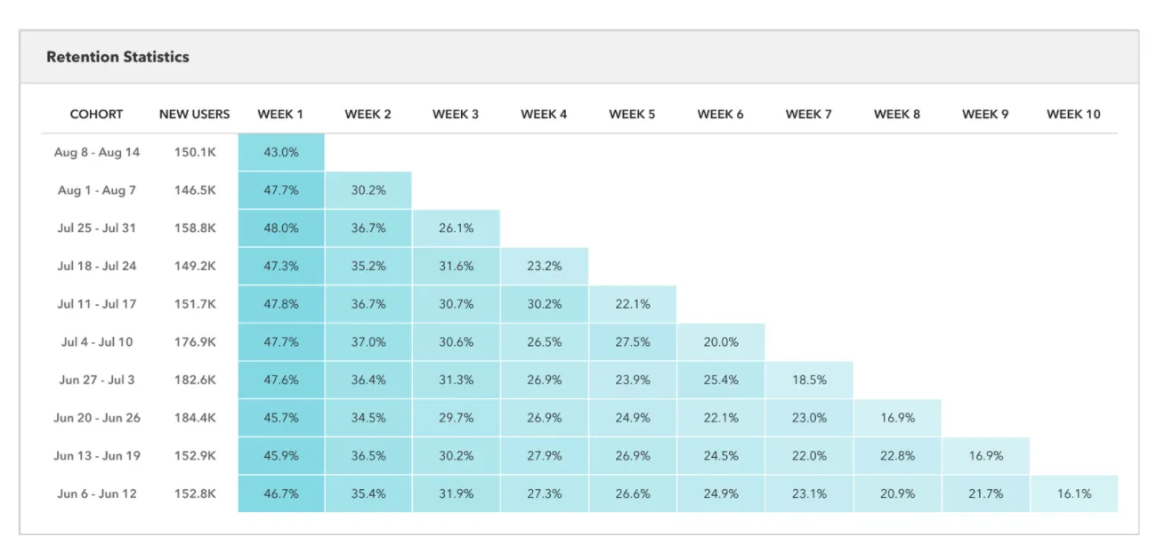
This chart shows how many users registered each week and how many of them were retained in each subsequent week. It is filtered to only “New Users.” Additionally, you can segment retention reporting for active users, churned users, inactive users, and reactivated users. That can help you locate your power users and understand what makes them stick. It’s expected that retention for these cohorts will be significantly different. So you should always cohort your users into different behavioral segments if you can. Like I said, your ability to create multiple user cohorts is linearly correlated with how well your analytics is set up.
In companies with more advanced data stacks, the product team has the ability to locate, test, iterate, and release new features to only specific user segments. Having these groups cleanly and precisely cohorted also speaks to the maturity of the analytical domain. It takes time to get there, though.
📗 Takeaways
🤝 Retention measures the ability of your product to keep (1) users (2) active (3) over time.
Depending on your business model and type, “users” can mean customers, free users, or free users with a purchase, so retention calculation and definition will be different.
“Active” can be a range of activity events, and often you have to pick the event that is available, consistent across your platforms, and clean.
“Over time” can be tricky to define—bound to a specific timeline or a rolling average? Pick your X-day or unbounded retention type based on your product usage.
📈 Reporting retention from product analytics tools has its own specifics. It’s faster and easier to create a report and slice and dice, but given the analytics setup at your company, it may be limited or lead you further away from the questions you want to answer.
🗄️ Getting retention data via SQL is not straightforward either, and your SQL code will be different depending on your underlying data structure and format. Create the foundation metrics tables first, then work on your SQL from there.
📊 Visualizing retention via cohort graphs is the best practice that gives you the most insights into user behavior patterns.
Other things to keep in mind
Given that retention includes so many elements of activity, it’s not the right metric to use for weekly reporting or as a baseline for an A/B test. Too often I have seen how product analytics teams evaluate experimentation against retention and wonder why the increase in user activity doesn’t lead to a change in retention. Because the activity is only one of the components of retention. Retention (like revenue) is the output metric. You should monitor it but not strictly utilize it as a goal for testing or campaigning.
Additionally, every new executive who comes in pushes for their own definition and reporting format. Therefore, product analytics should be flexible with the dashboards and data sources to adopt whatever new retention meaning is requested (for example, changing app_open event to login, or 30-day retention calculation to rolling 28 days).
I’ll stop here, but there is much more to retention to cover—the specifics of revenue retention reporting, retention differences between SaaS and B2C or B2B, handling user outliers, working with retention curve patterns, retention growth-rate benchmarks, and more.
Thank you for reading! If you want to learn more about analyzing, measuring, or reporting user behavior, product metrics, or A/B tests, subscribe to my Data Analysis Journal, a weekly newsletter about product analytics and data science.
📚 Further study
Everything You Need to Know About Retention (Rates) from ChartMogul
Lecture 6: Growth from Alex Schultz, VP of Analytics, Meta
3 Things Your User Retention Rate Is Hiding from Mode
Cohort Analysis That Helps You Look Ahead from Mode
How to increase your retention
What is good retention
User Engagement and Activity Histogram Analysis from Olga
Day of the Week Analysis in SQL from Olga
Excel template for cohort analyses in SaaS from Christoph Janz
How Cohort Analysis Improves Retention & Reduces Churn from Heap
Thanks, Olga! Have a fulfilling and productive week 🙏
📣 Hiring, or looking for a new gig? Join Lenny’s Talent Collective.
Join Lenny’s Talent Collective to get bi-monthly drops of world-class hand-curated product and growth people who are open to new opportunities.

If you’re looking for a new gig, join the collective to get personalized opportunities from hand-selected companies. You can join publicly or anonymously, and leave anytime.
❤️🔥 Featured job opportunities
Walmart: Sr./Principal Product Manager (Store No8 incubator) (S.F., Manhattan, San Diego, Seattle)
If you’re finding this newsletter valuable, consider sharing it with friends, or subscribing if you haven’t already.
Sincerely,
Lenny 👋
How to measure cohort retention
 | A guest post by
|
Discussion about this post
No posts
Great stuff, thanks for writing this both!
Couple of additions:
1) I was a bit surprised there was no mention to the Reforge approach to identifying your retention metric. Each product might have multiple use cases (eg. renting and hosting for Airbnb) which have different frequencies (daily, weekly, monthly). This might land teams to monitor different retention metrics for different customers.
2) Once retention curves are visualized, it might be helpful to segment them by criteria like: geo, device, UTM parameters, etc to deepen the insights from the retention metric
3) Appreciate the detailed SQL guide and reference to the usual suspects of product analytics. Lately, I’ve been using June.so which directly visualizes retention cohorts and segments based on Segment events. It’s so easy and delightful!
Hope this helps, keep up the great work! 🤝
Oh my god this is exactly what I needed. Thanks, Olga and Lenny!