A burndown chart visually tracks a project’s progress by plotting the remaining work against time. The horizontal axis represents time, usually measured in days or sprints, while the vertical axis displays the amount of work left, quantified in hours or story points. This tool is useful for monitoring progress in Agile projects.
The chart shows all the remaining work at the start of a project. As the project progresses and tasks are completed, the line on the chart “burns down” towards zero, indicating that the work is being done.
The ideal burndown line is a straight, diagonal decline from the top left to the bottom right of the chart, representing steady progress. Deviations from this line indicate issues or delays in the project, helping teams adjust their efforts accordingly.
Using this chart, you can forecast the project’s completion.
Types of a Burndown Chart
A burndown chart can be of the following two types:
Sprint Burndown Chart
A sprint burndown chart tracks work progress within a single sprint in Agile frameworks. It shows how much work remains versus the time left in the sprint. The horizontal axis represents the days of the sprint, while the vertical axis indicates the remaining work, often measured in story points or hours.
The chart displays the total work planned at the start of the sprint. As the sprint progresses and tasks are completed, the line on the chart declines, ideally reaching zero by the end of the sprint. This chart helps teams visualize daily progress and identify issues early.
Product Burndown Chart
A product burndown chart provides an overview of progress across an entire project or product. It tracks the remaining in the project backlog against time. The horizontal axis represents time, while the vertical axis shows the total remaining work, measured in story points or hours.
Unlike the sprint burndown chart, which focuses on individual sprints, the product burndown chart offers a broader view of the project’s progress toward completion. It helps stakeholders monitor progress, assess project health, and adjust plans.
Components of a Burndown Chart
To interpret a burndown chart, familiarize yourself with its components and follow it from the top left to the bottom right.
Here are key elements of the burndown chart:
- Start Point: This is located at the top left of the chart.
- End Point: This is situated at the bottom right.
- Timeline: Represented on the X-axis, the timeline can be measured in hours, days, weeks, or other units.
- Remaining Work: Shown on the Y-axis, this indicates the amount of work left to be done based on estimates.
- Ideal Work Line: A straight, downward-sloping line represents the ideal progress, assuming work is completed consistently.
- Actual Work Line: This line shows the real progress of the project. It may deviate from the ideal work line, reflecting the varying pace at which different teams complete their tasks.
Step-by-Step Process to Create a Burndown Chart
The following is a stepwise approach to creating a burndown chart.
Step 1. Collect and Analyze Data
Begin by gathering relevant data for your project. This includes the planned work, measured in story points, hours, or tasks. Ensure you understand the project’s scope and the estimated timeframes for each task. Analyzing this data will provide a baseline for tracking progress and help you set realistic expectations for the project timeline.
Step 2. Estimate the Required Effort
Estimate the effort needed to complete the tasks. This involves assessing each task or feature and assigning it an appropriate measure of effort, such as story points or hours. These estimates should reflect the complexity and time required to complete each task. This initial estimation will serve as the starting point for your burndown chart, representing the total work at the beginning of the project or sprint.
Step 3. Track Daily Progress and Remaining Work
Monitor and record the progress of the project on a daily basis. Update the amount of remaining work each day based on the tasks completed and any new tasks or changes that arise. This ongoing tracking is essential for maintaining an accurate view of the project’s progress and ensuring that the burndown chart reflects the current status of work remaining.
Step 4. Calculate the Actual Effort Spent
Calculate the actual effort spent by comparing the estimated effort with the work completed each day. This involves summing up the hours worked or story points completed and comparing these figures with your estimates. Doing so lets you assess whether the team is ahead of or behind schedule and adjust your expectations and plans accordingly.
Step 5. Compile the Final Data
After tracking progress and calculating effort, compile the final dataset. This includes all recorded values of remaining work and actual effort spent throughout the project. Organize this data in a structured format, ensuring that it accurately reflects the project’s progress and is ready for visualization.
Step 6. Plot the Burndown Chart
Create the burndown chart by plotting the compiled data. On the X-axis, represent the timeline, which could be days, sprints, or other time units. On the Y-axis, plot the remaining work. Draw two lines: the ideal work line, which shows the expected progress if work is completed steadily, and the actual work line, which shows the real progress. This visual representation will help you track project progress and identify any deviations from the plan.
Burndown Chart Example
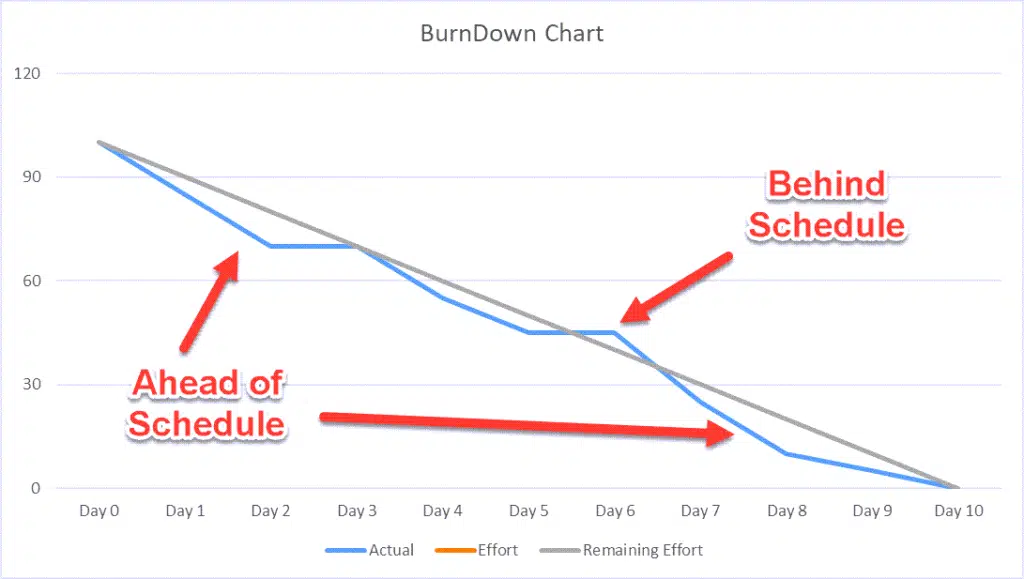
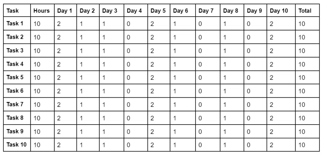
Duration: 10 days
Sprint Backlog: 10 tasks
Velocity: 100 hours
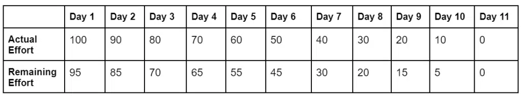
100 hours over ten days equates to 10 hours daily. The data should be captured daily to create the burndown chart. The total starts with 100 hours, then 90 hours left 1 (100 – 10) at the end of the day, 80 hours left at the end of day 2, etc.
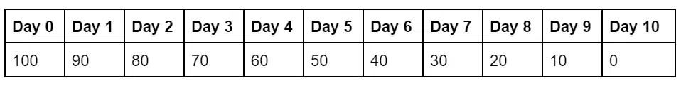
The daily planned progress is recorded in the table below.
The remaining effort is captured at the end of the day. The effort caught is the total (sum) of the calculated or estimated time remaining at the end of each day.
Plotting BurnDown Chart
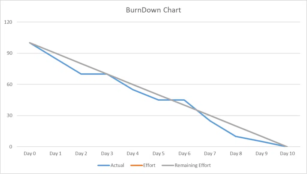
- The X-axis represents time in hours.
- The team has 10 days and 100 hours to complete the task.
- The Y-axis represents the days.
- This graph is applicable in an ideal situation where a team follows the plan and completes the tasks within the given time.
- On the graph, on Day 1, all tasks are pending; this marks the starting point.
- The team could not meet the stipulated line graph, so they started as a flat horizontal plane and burned downward towards 0.
- Burning down a chart means arranging events on the chart from the total expected tasks, i.e., 100% to its full completion.
The Benefits Of Using a Burndown Chart
A burndown chart is highly useful and effective for agile projects in several ways:
- Status Reporting: The primary advantage of a burndown chart is that it tracks and measures progress, providing a clear view of the remaining effort required. It shows the pace at which the project is advancing, reflecting the completion rate of user stories within an iteration.
- Early Detection of Issues: A burndown chart shows if a project falls behind schedule and highlights obstacles hindering progress. During daily Scrum stand-up meetings, the chart helps the team understand their current status and areas needing attention, allowing for timely interventions before minor issues become major problems.
- Motivation and Performance Improvement: The burndown chart keeps team members aligned and motivated by comparing actual project performance with an ideal baseline. It provides valuable insights for sprint planning, enabling better resource and task allocation to boost efficiency.
- Simplicity and Clarity: Unlike complex Scrum designs, a burndown chart is straightforward to create and easy to understand. It simplifies the monitoring of project progress and velocity, making it accessible to all team members.
Limitations of a Burndown Chart
A burndown chart faces several challenges:
- Insufficient Detail for Scope Creep Detection: A burndown chart provides a high-level overview but does not capture detailed information about changes in the product backlog. This makes it challenging to determine if chart fluctuations are due to scope changes or milestone achievements. To address this, a separate line indicating the backlog size can be added to the chart.
- Dependence on Progress Baseline: The effectiveness of a burndown chart depends on the accuracy of the initial work baseline. If the baseline is incorrect, it can mislead interpretations of the progress line. To improve accuracy, including an efficiency factor that adjusts the chart after each iteration can help reflect a more precise progress view.
- Focus on Completion Over Future Planning: A common challenge with burndown charts is that they often lead team members to focus solely on reaching zero effort, neglecting future sprint planning and activities. It is important to balance the focus on current progress with considerations for upcoming tasks and goals.
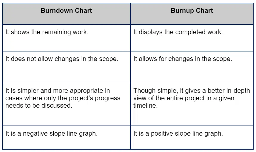
Burndown Chart Vs Burnup Chart
A burnup chart differs from a burndown chart in its focus and presentation. While a burndown chart shows the amount of work remaining over time, a burnup chart tracks the amount of work completed and the total scope of the project. This dual perspective allows burnup charts to highlight scope changes more clearly, as the total work line will adjust to reflect additions or deletions in scope.
Burndown charts only show the remaining work, making it harder to identify scope changes. Burnup charts provide a more comprehensive view of progress and scope, improving project tracking.
Conclusion
A burndown chart is a visual tool for tracking project progress and communicating updates to stakeholders effectively. It is easy to create and follow, helping the project team monitor and manage project advancement efficiently.
Further Readings:
- What is a Burnup Chart?
- How to Track Project Progress?
- Control Chart Vs Run Chart

I am Mohammad Fahad Usmani, B.E. PMP, PMI-RMP. I have been blogging on project management topics since 2011. To date, thousands of professionals have passed the PMP exam using my resources.