By using the Oreo Logo PNG,
you agree to the Privacy Policy.
A favorite sweet for kids and adults, Oreo cookies are recognized as the best-selling cookie brand of the 21st century. In memory of those old days, the street where the cookie shop was located at that time was called “Oreo Way”. Another interesting fact is that half of the consumers split the cookie into two halves before eating. The “Twist, Lick, Dunk” marketing campaign was surely successful.
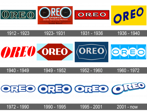
A world-famous sweet product appeared at the beginning of the last century. The first Oreo rolled off the production line at the Chelsea Market bakery in Manhattan in 1912 and was sold in Hoboken, New Jersey. It was packaged in large tin cans and sold for 30 cents a pound. The recipe was developed by the National Biscuit Company (Nabisco). The Oreo brand is registered as a trademark of Nabisco in 1913. The history of Nabisco began in 1898 with the merger of several baking companies. Since then, cookie production has long gone beyond the USA. Today, it is not only exported all over the world but also produced in many countries. Oreo Nabisco is now owned by Kraft Foods. Where did the name Oreo come from? Even the oldest employees of Nabisco are not sure, but the most popular version is the combination of the syllable “re” from the word “crème” with two letters “O” symbolizing cookies on both sides.
What is Oreo?
Oreo is the most loved and best-selling cookie brand of the 21st century. Even after numerous modern variations and experiments with flavors, fillings, and sizes, Oreo cookies remain as incredibly tasty and tender as they were many years ago.
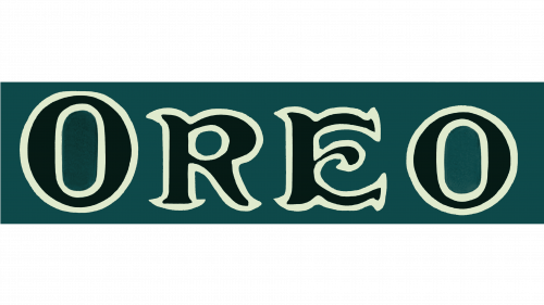
The first Oreo logo looked luxurious thanks to a rich green and white color palette and elegant font with beautiful serifs. Although all the letters looked uppercase, the first “O” was slightly higher than the rest. The company used for over ten years.

This logo has a completely different feel. The color palette was changed to light blue, white, and brown with red for the background. The brand name featured a sans-serif font. The letters were off-white and had a light blue shadow that created a 3D appearance. The most memorable part of this logo was the two “O”s, which were enlarged and had an Oreo cookie in the center. Besides drawing a link between the brand name and its product, this created a very symmetrical and balanced image. Underneath, the emblem had inscriptions printed in several lines using different font styles.
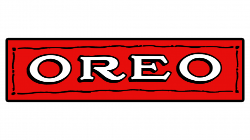
The company preserved the white, red, and black colors from the previous version, but this time, the logo was much simpler. A red banner with a thin black frame featured the name of the company printed using a stylish serif font. The white letters had a thick black outline that made them stand out on a bright background.
The company was not afraid to experiment with a new brand image. This time it came up with a bright yellow background for its brand name. The latter was placed on a diagonal and used a basic, sans-serif font of a dark blue color. The image was playful and surely attracted the attention of kids and adults to the product it was decorating.

The red color was brought back and used for the brand name, making it stand out on the white background. “Oreo” wordmark had a bold, geometric font, clean lines, and delicate serifs. It was placed on a diagonal with the letters getting smaller towards the right. There were no other details.

The new design of the Oreo brand logo had a burgundy rhombus background with a relatively simple, sans-serif typeface for the lettering. A light blue background behind the rhombus was an interesting choice.

Along with the change in the design of the cookie pattern, which consisted of elements of the Nabisco Biscuit Co logo being added to the cookie design, the logo underwent some changes as well. The curved leg of the letter “R” along with an ornate frame around the name added a sophisticated and luxurious touch. The dark blue background further strengthens an association with the original logo.
A very minimalistic logo was introduced in 1960. It had a light blue color that created a calm feel. Although the typeface was basic, oblong “O”s and letters that were placed at different heights added dynamics and interest.
The previous logo was given an update. The letters got much bolder, so they were touching in some places. In addition, they acquired a thin, dark blue outline, while the light blue was replaced by white. This created a more cohesive and confident feel and was a good representation of a brand that was on the market for 60 years at the time. This logo served as the basis for the brand image we know today.
This emblem had a lot in common with the previous one. However, it looked softer thanks to rounded corners and in line with all the good feelings Oreo cookies can be associated with. The dark blue outline got thicker, while the addition of a lighter outline on the outside of it made it seem that it was glowing.
Not long after the last modification, the company updated the font to make it look sharper. Otherwise, the brand image underwent minimal changes.
The brand image was modernized after it changed owners. The letters and background acquired some volume. They were placed on a diagonal and similar to the 1940 version, the letters go smaller towards the right, which created an interesting perspective.
The brand’s color palette changed several times, but there are several prominent ones worth mentioning. The period from 1923 until 1952 was marked by red, white, and black colors. After that, it was blue and white with a bit of black for an accent. It is a good color choice for a company that wants to show its loyalty to the consumers. When it comes to fonts, the company went back and forth between more elegant and stylish serif typefaces and less fancy, sans-serif options.
 Pringles Logo
 Lays Logo
 Nabisco Logo
 Oreo Logo
 Quaker Logo
 Whataburger Logo
 Hershey Logo
 Amul Logo
 Danone Logo
 Milka Logo
玻璃钢生产厂家杭州常用玻璃钢花盆淄博玻璃钢花盆花器成都个性化玻璃钢雕塑优势阜阳欧式玻璃钢雕塑北京景观玻璃钢雕塑加工佛像玻璃钢雕塑销售厂家荣昌区玻璃钢雕塑梧州商场美陈运城镂空玻璃钢雕塑厂家广东园林玻璃钢雕塑定制商业街玻璃钢雕塑批发安徽花钵玻璃钢雕塑定做玻璃钢鹿雕塑哪家值得信赖句容玻璃钢艺术雕塑设计嘉兴大型玻璃钢雕塑浙江玻璃钢仿铜雕塑玻璃钢思考阅读人物雕塑深圳玻璃钢动物雕塑价格洛阳泡沫玻璃钢雕塑宽城区玻璃钢雕塑工程玻璃钢卡通雕塑动物价位澧县玻璃钢造型雕塑太原泡沫玻璃钢雕塑成都人物玻璃钢雕塑供应商深圳楼盘玻璃钢雕塑湖北户内玻璃钢雕塑订做价格玻璃钢景观雕塑蝴蝶邯郸玻璃钢人物雕塑价格特色商场美陈有哪些玻璃钢冰雪奇缘雕塑卡通香港通过《维护国家安全条例》两大学生合买彩票中奖一人不认账让美丽中国“从细节出发”19岁小伙救下5人后溺亡 多方发声单亲妈妈陷入热恋 14岁儿子报警汪小菲曝离婚始末遭遇山火的松茸之乡雅江山火三名扑火人员牺牲系谣言何赛飞追着代拍打萧美琴窜访捷克 外交部回应卫健委通报少年有偿捐血浆16次猝死手机成瘾是影响睡眠质量重要因素高校汽车撞人致3死16伤 司机系学生315晚会后胖东来又人满为患了小米汽车超级工厂正式揭幕中国拥有亿元资产的家庭达13.3万户周杰伦一审败诉网易男孩8年未见母亲被告知被遗忘许家印被限制高消费饲养员用铁锨驱打大熊猫被辞退男子被猫抓伤后确诊“猫抓病”特朗普无法缴纳4.54亿美元罚金倪萍分享减重40斤方法联合利华开始重组张家界的山上“长”满了韩国人?张立群任西安交通大学校长杨倩无缘巴黎奥运“重生之我在北大当嫡校长”黑马情侣提车了专访95后高颜值猪保姆考生莫言也上北大硕士复试名单了网友洛杉矶偶遇贾玲专家建议不必谈骨泥色变沉迷短剧的人就像掉进了杀猪盘奥巴马现身唐宁街 黑色着装引猜测七年后宇文玥被薅头发捞上岸事业单位女子向同事水杯投不明物质凯特王妃现身!外出购物视频曝光河南驻马店通报西平中学跳楼事件王树国卸任西安交大校长 师生送别恒大被罚41.75亿到底怎么缴男子被流浪猫绊倒 投喂者赔24万房客欠租失踪 房东直发愁西双版纳热带植物园回应蜉蝣大爆发钱人豪晒法院裁定实锤抄袭外国人感慨凌晨的中国很安全胖东来员工每周单休无小长假白宫:哈马斯三号人物被杀测试车高速逃费 小米:已补缴老人退休金被冒领16年 金额超20万